In a series of posts on both Coding Horror and the linked Me Talking Out Loud, comments have arisen that suggest Venn diagrams are insufficient to properly represent SQL Joins.
I totally disagree, Venn diagrams fit perfectly. The biggest problem is that people creating the diagram assume that the Table is one of the sets. This is apparently the problem again with Jeff’s and Ligaya’s diagrams.
Here’s one of Jeff’s awesome images:
We’ve seen this as the classical starting point to explain joins in relational databases. Once you get over the mechanics of what the JOIN operations do, you need to abandon this thinking quickly and focus on just what are those sets, otherwise you keep thinking about tables, not conditions.
For instance, how are these SQL statements different?
SELECT *
FROM customer
INNER JOIN order ON order.id = customer.id
WHERE
    order.total > 100


SELECT *
FROM customer
INNER JOIN order ON order.id = customer.id
    AND order.total > 100
They aren’t. In a Venn Diagram, this could be represented as:
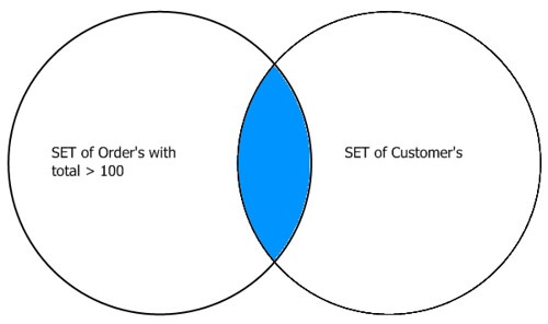
Next time you’re working up some SQL code, start first with what you are trying to get, and then focus on how to they relate with a JOIN.
What about the CROSS JOIN you say? Instead of this (from Ligaya):

Draw a large circle with the product of the areas of your original sets… :)